Beer IoT: Visualizing sensors data using Power BI
We are eager to try out our beer cooling solution and we want to see it in action. We want to visualize our data and keep eye on temperature of cooling beer. Before doing anything more complex like building web or mobile app we make a quick shortcut and bring our data to web, desktop and mobile. This post is about Power BI in action.
- Beer IoT: Measuring temperature with Windows 10 IoT Core and Raspberry Pi
- Beer IoT: Moving to ITemperatureClient interface
- Beer IoT: Measuring cooling rate
- Beer IoT: Making cooling rate calculation testable
- Beer IoT: Estimating beer cooling time
- Beer IoT: Reporting measurements to Azure IoT Hub
- Beer IoT: Using Stream Analytics to save data from IoT Hub to SQL database
- Beer IoT: Visualizing sensors data using Power BI
- Beer IoT: Building Universal Windows Application to monitor cooling process
Update. Source code of my TemperatureStation solution is available at Github. The solution contains IoT background service and web application you can use right away. Readings are reported to MSSQL or Azure IoT Hub. Documentation is available at TemperatureStation wiki. Feel free to try out the solution.
What is Power BI?
Power BI is online data visualization platform by Microsoft. It works on desktop, tablets and mobile devices.
Microsoft: Microsoft Power BI transforms your company’s data into rich visuals for you to collect and organize so you can focus on what matters to you. Stay in the know, spot trends as they happen, and push your business further.
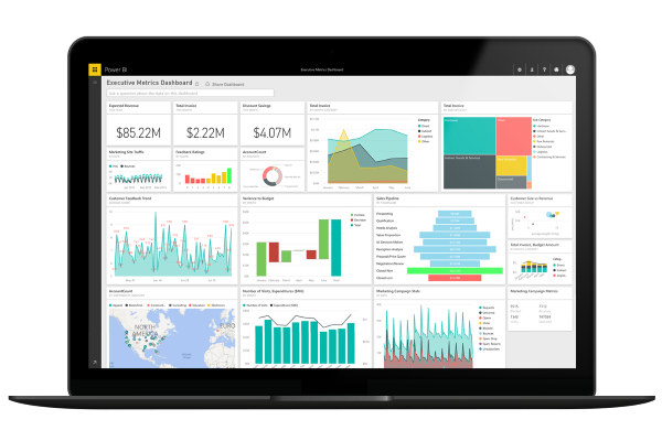
With Power PI we get temperatures to desktop and mobile with one shot. To get started you have to create Power PI account. It’s free until you have small demands like we have here.
Getting data to Power BI
In previous Beer IoT post Using Stream Analytics to save data from IoT Hub to SQL database we created Stream Analytics job to move sensors data from Azure IoT Hub to SQL Azure database. Our SQL Azure database was just one output source for Stream Analytics job. Same way we may add other types of output sources and among supported types we find also Power BI.
NB! Adding and configuring Power BI output source is currently possible only in Azure management portal. New portal doesn’t support it yet.
Now let’s make Stream Analytics job to pump data to Power BI. Go through the following steps to make it happen.
- Open old management portal and move to Open Stream Analytics job we created in previous post.
- Click on “Outputs” menu and then on “Add output” button.
- Select “Power BI” and click arrow to move to next page.
- Under “Existing Microsoft Power BI” section click on “Auhtorize now” link.
- Log in to Power BI.
- Fill required fields:
Output alias – name of output source
Dataset name – name of Power BI dataset (by example: Beer IoT)
Table name – Measurement
Workspace – leave it like it is - Click on check button to save data.
Next we have to modify our query and make it insert data to Power BI output source too. Here is the query.
SELECT
    batchKey as BatchKey,
    MAX(CAST([timeStamp] AS datetime)) as Time,
    AVG(beerTemp) as BeerTemp,
    AVG(ambientTemp) as AmbientTemp
INTO
    [SqlAzureBeerIoT]
FROM
    [FromIoTHub]
GROUP BY
    batchKey,
    TumblingWindow(minute, 5)

SELECT
    batchKey as BatchKey,
    MAX(CAST([timeStamp] AS datetime)) as Time,
    AVG(beerTemp) as BeerTemp,
    AVG(ambientTemp) as AmbientTemp
INTO
    [PowerBI]
FROM
    [FromIoTHub]
GROUP BY
    batchKey,
    TumblingWindow(minute, 5)
Duplicating is not nice or polite solution but I didn’t found any better way to accomplish the goal right now.
If you run Stream Analytics and beer cooling solution then after five minutes you should see new dataset appearing to Power BI interface.
NB! It’s easier to build reports and dashboards in Power BI if you have some data already waiting there. To get data run Stream Analytics job and beer cooling solution and let solution report measurements for around 20-30 minutes.
Building beer cooling report
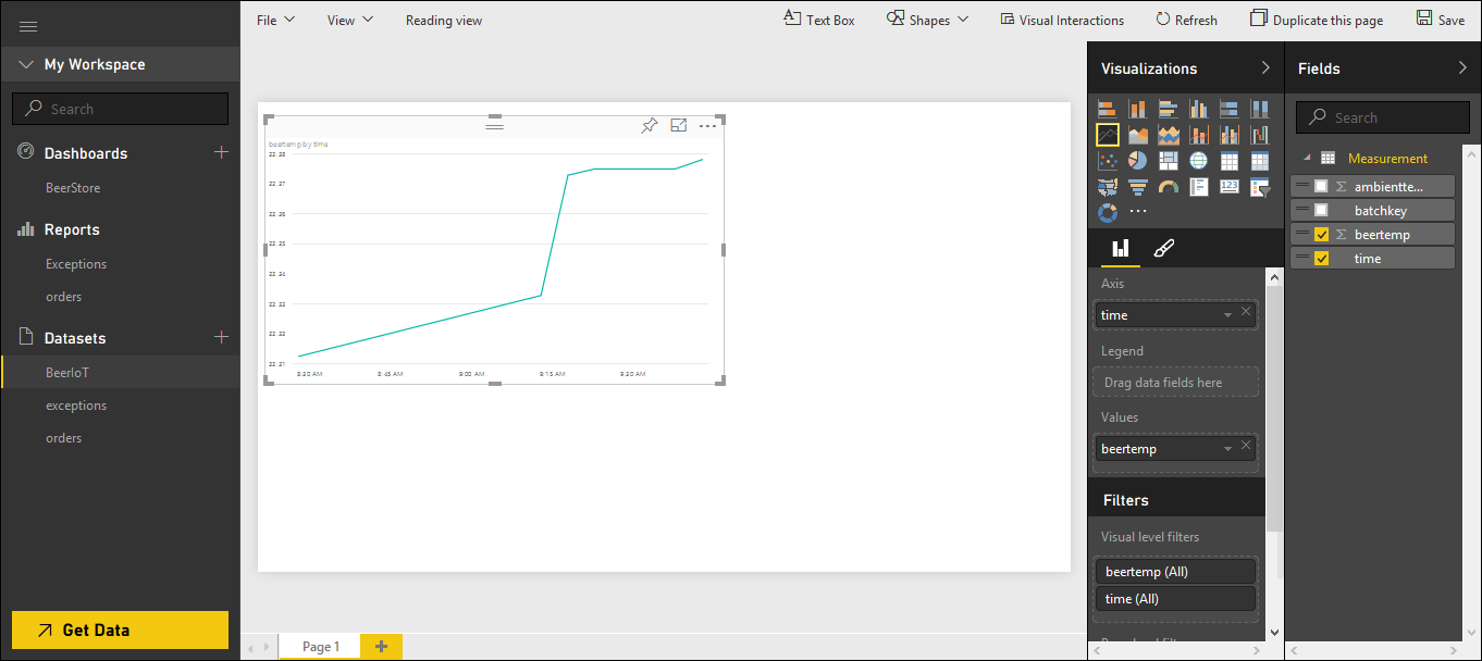
Now let’s build beer cooling report. Log in to Power BI through your browser ańd under Datasets section on left select BeerIoT (this must be the name you gave to dataset when you added new output source to Stream Analytics job).
Select line chart under visualizations, drag it wider and configure it like shown on the screenshot below.
Click on somewhere on empty space near chart to get it out from focus and click on table under visualizations. Configure table like shown on the following screenshot.
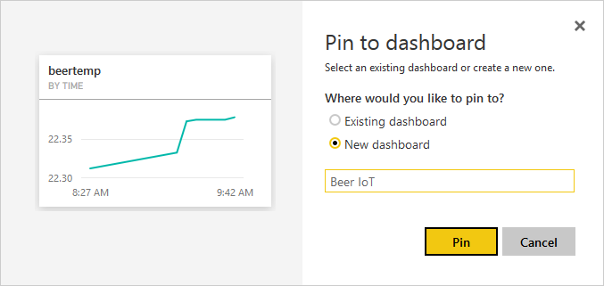
Now save your report and name it as “Beer cooling” by example. Under reports menu on left select the report you just created. Click on pin button of line chart and add it to Beer IoT dashboard.
If you click on dashboard you will see beer cooling chart there. When beer cooling solution is running then chart will be updated in real-time. I added also measurings table to dashboard and changed their sizes to make dashboard look better.
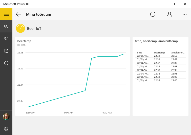
Power BI on your desktop
On Windows 10 open store form taskbar and search for Power BI. Install Power BI application to your machine and run it. Log in if needed and open your beer IoT dashboard.
You can click on chart and table to see them in large. Also you can open your beer IoT report and see it on your desktop. In report view you can also use filters if you defined some.
Going mobile
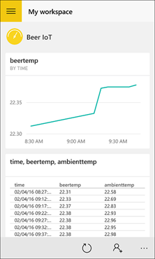
Now take your Windows Phone 10, open store and search for Power BI. Install Power BI app to your phone and run it. Log in to Power BI when asked and open beer IoT dashboard you created before.
We see almost same thing also on Power BI mobile app. If you like you can pin this dashboard to home screen of your Windows Phone.
Wrapping up
It was first time when we visualized our measurements data. We added new output source to Stream Analytics job to send aggregated measurements data to Power BI. On Power BI we created beer cooling report and dashboard. After this we can monitor beer cooling through web browser and also through Power BI desktop and mobile apps. We wanted to get our data visualized and we did with minimal time and effort.







Pingback:Beer IoT (need I say more?) - IT大道