ASP.NET MVC 4: New template for web applications
I’m playing with ASP.NET MVC 4 Developer Preview. There is new default application template available for ASP.NET MVC 4 web applications. New template is modern, has better look than current one and has better support for different screen sizes. In this posting I will show you how new template looks like.
When you create new internet application and open it in your web browser then you will see this nice and simple page.
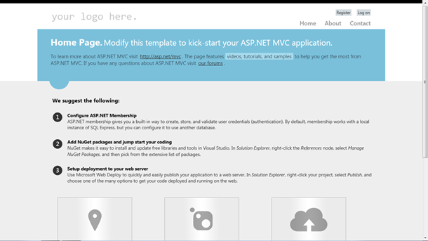
ASP.NET MVC 4: Main page of new default web application.
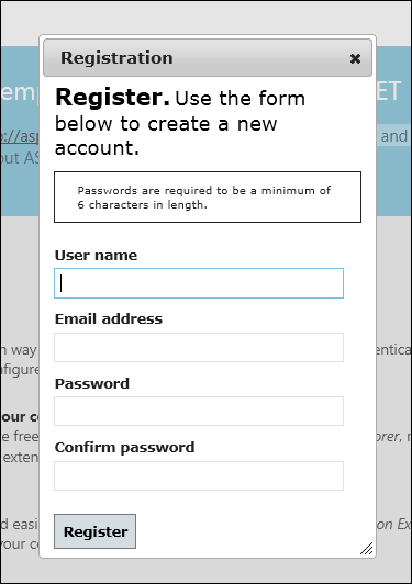
The registration paged is shown in two different modes. When you click Register link then registration form is shown in dialog. You can also type in URL to registration view and then it it shown as usual page.
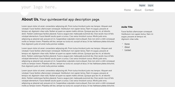
New template provides different page layout for content pages. There’s no big header and you can also see menu on right.
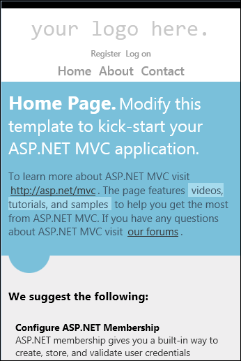
New template supports also adaptive rendering and looks nice also on devices with small screen. You can try it also with your browser by making browser window smaller.
New templates look better than old ones but I think there’s still room enough for improvements like hierarchical menus and more professional look. Although I can always find something to take on I still think that new template looks nice and you can use it at least in your in-house applications.






I like the new template. Much better then previous :)
I share the opinion that the new look is a way better than the old one.
But what you mean by “hierarchical menus” and more professional look? By hierarchical menus you mean something like MvcSiteMapProvider provides?
It doesn’t matter if it is public web site, some portal or intranet application – you still need more than one level for navigation. It’s not nineties anymore :)
By more professinal look I mean something that has more wow-effect on customers.
Someone know if this template can be migrated to an asp.net 4 web application project?