<asp:Chart>
Scott Guthrie had some good news almost week ago – there is new charting component for ASP.NET available now. Component is made by Microsoft and it is free to download. This component fills one important hole in ASP.NET components gallery. We have now very powerful charting component that is highly customizable and configurable. There is also available chart control add-on for Visual Studio 2008.
I suggest to start with chart control samples because this cotrol has a lot of features. Sample application gives you good overview about what you get and how chart control works. After downloading sample application you have to unpack it and open it with Visual Studio. After compiling you can run the application and browse through different chart types and samples.
My little sample
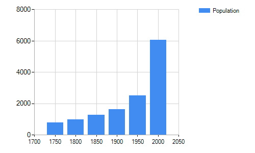
I made a quick sample application that shows human population growth using ASP.NET chart control. I took data from Wikipedia. There is an article titled as World population. I am using numbers divided by million. So if you take number from table then multiply it by million.
Year | Population |
1750 | 791 |
1800 | 978 |
1850 | 1262 |
1900 | 1650 |
1950 | 2519 |
2000 | 6071 |
Now let’s create web application with Visual Studio. Open default.aspx and add chart control to page. Modify page source so chart definition looks like this.
<asp:Chart ID="Chart1" runat="server" Width="500">
    <series>
         <asp:Series
                Name="Population"
                XValueMember="Year"
                YValueMembers="Population"
                IsVisibleInLegend="true">
        </asp:Series>
    </series>
    <chartareas>
        <asp:ChartArea
                Name="ChartArea1"
                Area3DStyle-Enable3D="true">
               <AxisX LineColor="DarkGray">
                   <MajorGrid LineColor="LightGray" />
               </AxisX>
               <AxisY LineColor="DarkGray">
                   <MajorGrid LineColor="LightGray" />
               </AxisY>
         </asp:ChartArea>
    </chartareas>
    <Legends>
        <asp:Legend></asp:Legend>
    </Legends>
</asp:Chart>
This is definition of our chart control. Now let’s bind data to chart.
protected void Page_Load(object sender, EventArgs e)
{
    var table = new DataTable();
    table.Columns.Add("Year", typeof(int));
    table.Columns.Add("Population", typeof(long));
    table.Columns.Add("Lbl");

    var row = table.NewRow();
    row["Year"] = 1750;
    row["Population"] = 791;
    table.Rows.Add(row);

    row = table.NewRow();
    row["Year"] = 1800;
    row["Population"] = 978;
    table.Rows.Add(row);

    row = table.NewRow();
    row["Year"] = 1850;
    row["Population"] = 1262;
    table.Rows.Add(row);

    row = table.NewRow();
    row["Year"] = 1900;
    row["Population"] = 1650;
    table.Rows.Add(row);

    row = table.NewRow();
    row["Year"] = 1950;
    row["Population"] = 2519;
    table.Rows.Add(row);

    row = table.NewRow();
    row["Year"] = 2000;
    row["Population"] = 6071;
    table.Rows.Add(row);

    Chart1.DataSource = table;
    Chart1.DataBind();
}
Now let’s run application. We should see something like this on our page.

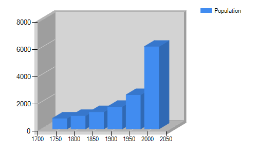
Of course you can make charts look much better if you have patience to customize them. Now let’s see how easy it is to make our chart cooler than it is. Let’s add new attribute to ChartArea element: Area3DStyle-Enable3D="true". Now we have 3D chart like this.

Now we have 3D chart representing same data as before. And we did almost nothing – in hurry we just added one attribute to chart definition. Because charts are created as images we can use chart control also to generate static images for static reports.


Wow, wasn’t aware this was made available – thanks for the information!
Graficos em Asp.Net
Pingback:ASP.NET MVC: Creating reports using Chart control | Gunnar Peipman - Programming Blog